CHIQUITITA
BRIEF: Design an identity and branding collateral for the new Surry Hills, Sydney bar CHIQUITITA.
CHALLENGE: Creating an identity that sits at the intersection of rigidness
and fluidity.
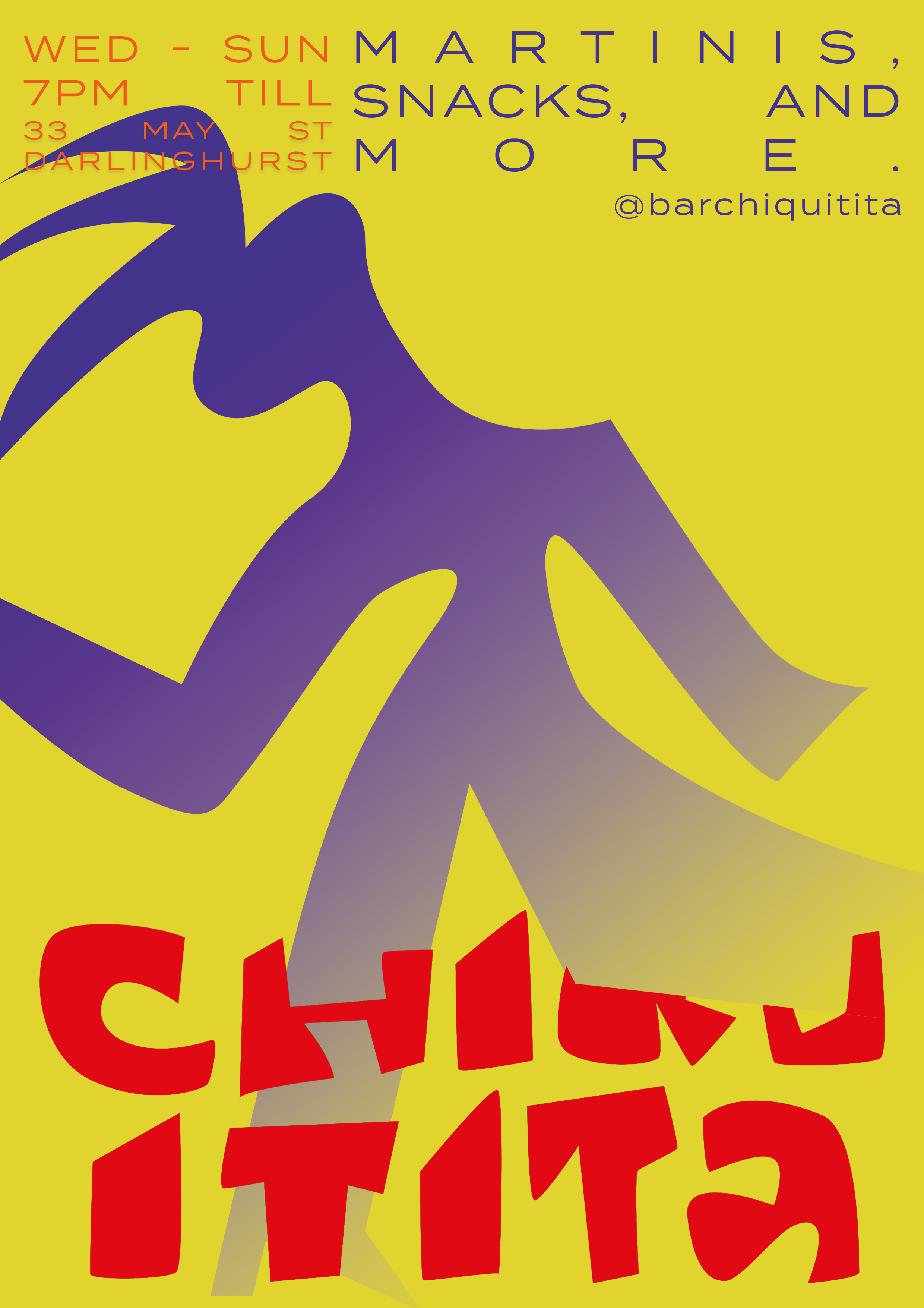
SOLUTION: The CHIQUITITA identity merges elements from the loud 1980s and progressive queer culture. The illustration style is fun, unrefined, and memorable.


To gather inspiration for the look and feel of the CHIQUITITA space, I asked DALL-E what ‘a photo of a modern 1970s inspired bar with the musician Grimes in it’ looked like and ‘a photo of a bar in the Bauhaus era’. DALL-E also gave me a 3D render of a futuristic cocktail. These images transported me to the CHIQUITITA interior, helping me visualise the design.

CHIQUITITA is a place where you can go and be unseen. There are no fit checks at CHIQUITITA. No selfies or IG stories and definitely no judgment. The logo had to represent this. The hand-drawn typography is perfectly imperfect.
The primary CHIQUITITA assets are six figures, each one inspired by an iconic Vogue dance pose. The figures are illustrated in a fluid yet sharp style to signify the political nature that Voguing was birthed from. Voguing began in queer Black and Latino communities, amongst their peers these individuals felt free to be themselves but in the outside world, they were harnessed and segregated.